Your startup is revolutionary. Your website? Boring.
Let’s fix that.
Here’s the brutal truth: Your website has 3 seconds to impress visitors. If it looks like it was designed in 2005, you’re losing customers (and investors).
But don’t panic—I’ll show you exactly what a killer startup website needs. And hey, if you’d rather skip the hard work, I design startup websites that convert (just saying).
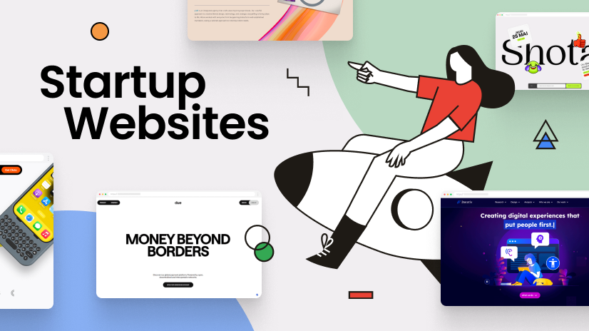
🚀 What Makes a Startup Website Stand Out?
1. A Headline That Doesn’t Suck
❌ “Welcome to Our Platform”
✅ “The Fastest Way to [Solve Pain Point]”
Why? Your headline should slap visitors in the face with value.
2. A Design That Doesn’t Look Like a Default WordPress Theme
- Clean but bold (no clutter, but not bland).
- Fast AF (if it loads slower than 2 seconds, you’re doomed).
- Mobile-friendly (or Google will bury you).
Pro Tip: Use bold colors and custom illustrations—generic stock photos scream “I didn’t try.”
3. A CTA That Actually Works
❌ “Learn More” (yawn).
✅ “Get Early Access →” or “Book a Free Demo”
Rule: Every section should push visitors toward ONE action.
4. Social Proof (Because Nobody Trusts You Yet)
- Logos of investors/clients (even if it’s just your mom’s LLC).
- Testimonials (fake it till you make it—just kidding… maybe).
5. A Story That Hooks
❌ “We are a SaaS company founded in 2023…”
✅ “We got tired of [problem], so we built [solution].”
People buy into stories, not jargon.
🤯 The Ugly Truth About Startup Websites
Most founders waste months tweaking their website instead of selling.
Here’s what happens:
- You obsess over fonts.
- Your competitor launches a ugly-but-clear site.
- They get all the users.
Don’t be that founder.
💡 Need a Website That Converts?
I design high-converting startup websites that:
✔ Look insane (in a good way).
✔ Work on mobile (because duh).
✔ Make visitors actually care.
Let’s chat. Or keep staring at your Wix editor—your call.
🎯 Final Tip:
Your website isn’t a brochure. It’s your best salesperson. Treat it that way.
TL;DR: If your startup website looks like a Geocities page, I can help. 😉